I am sharing LuAru Studio‘s website branding process and a sneak peek into how I came up with the name. You get a front row information about my own web design and development business branding process. This was a very personal process that I went through, but I also believe that our freelancing projects, small businesses, or book launches are exactly that – very personal ventures. Sure, we can try and find some professional distance, and yet I believe that the best brand is the one that has personality and it’s not easy to achieve it without a personal approach.
How does one name their web design service business?
I’m sure a lot of people will relate to this but once we come up with a business idea almost instantly we want to know how it is going to be called. I won’t lie, for me the process of naming my web site design business was tedious. I went through it all in my head and I don’t even remember most of the ideas that came to me, I thought I will never get it right. But I clearly remember the moment the idea of combining my kids’ names into something special hit me. After all, they are the very driving force that motivates me daily.
Suddenly it wasn’t hard, the name pretty much materialised itself instantly; when I knew it had to be made from Luana and Aras – LuAru – web design studio – came to be. Unfortunately, life is not linear, and things don’t just happen one after another like in a story. There were certain other things going on that withheld me from becoming a full-time web design freelancer a little while longer but I am here now.
Taking ownership of the process
It’s easy to get lost in all the opportunities but action takes place much quicker when you know exactly what you want. I was set on being a full-time web design developer and marketer, and the feeling alone energised me to act. I also always suggest to start with a business plan and for me locally I found Queensland Government’s tools the most useful ones, maybe you can find something similar in your area. As for marketing plan, there were no questions that I will do my own website branding and marketing. And oh boy… we are our worst clients, aren’t we?
Website branding for someone else is one thing but working for myself – is another. For one I seemed to not know how to fit everything in one simple logo mark. I wanted a lion and an eagle, then a sun and a moon to represent my kids, and many other elements (none of them ended up in the finished project). I was so proud of the name that it felt like everything else had to be huge too, and that’s why I got way too nitty gritty with myself.
But don’t worry, you are reading this, because I finally managed to make it all happen.
User research is important, but so is your brand personality
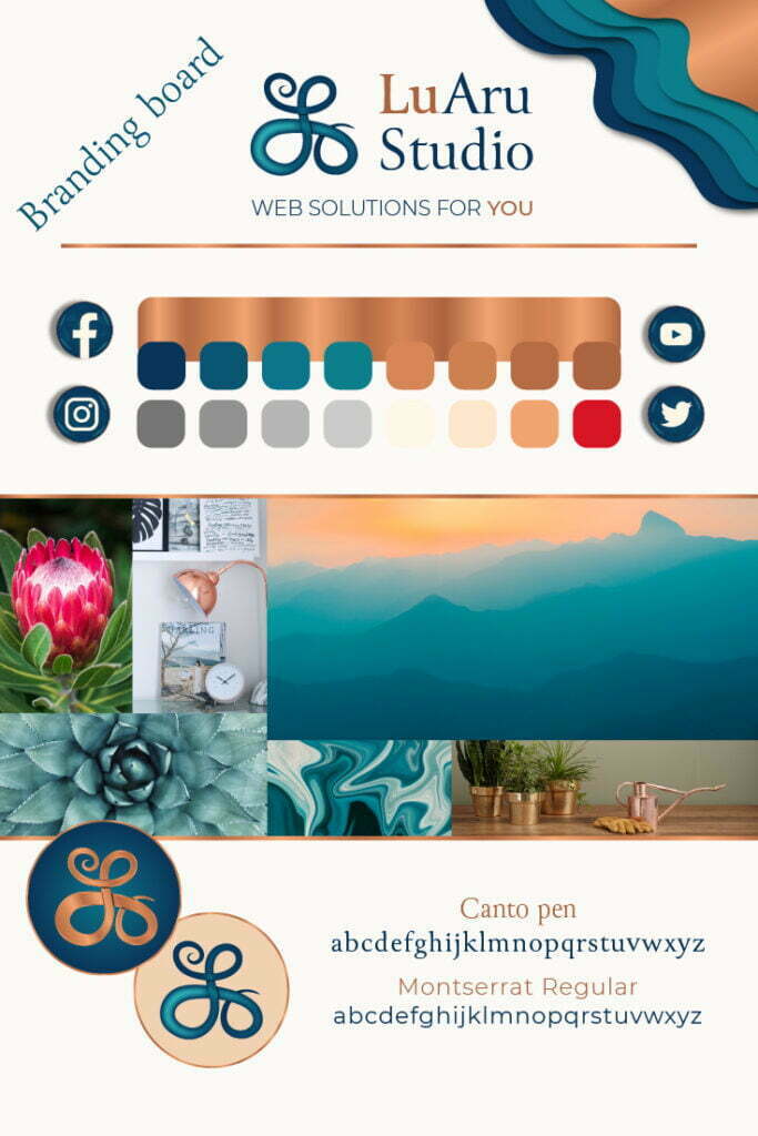
Marketing and user persona research is one of the most important things when offering services, no doubt in that. But even though I know how important that is I would lie saying that niching didn’t scare me. I can’t say that I am in a very particular niche now, but I have a client persona in mind that I wanted to reach with my creative website branding. This ideal guided me through every single step of my way – making a logo, choosing typography and colours. I do believe in importance of all these steps. And yet when it comes to small projects website branding, it still needs to match your own personality if the brand is being based on you. I am such a versatile personality that it was a challenge to narrow down what I want this business to represent. Three words came to my mind constantly – INTEGRITY, CREATIVITY and SERVICE.
- INTEGRITY is a crucial part of my professional life, and I always felt proud when others noticed that about me. Without any doubt I knew that this is the side of me I wanted to pour in this business. As it often happens the things, we are most proud of, the opposite of that scares us most too. One of the biggest fears holding me back while starting this business was letting someone down. Not that I would ever do that intentionally but the fear that something might happen where my client wouldn’t see my best was suffocating, until I knew that I must walk through that fear and promise myself and my business to always come with integrity and have faith that it will be enough whatever comes. And of course, there will always be things out of my control but if I come at my web design projects with my integrity, I can always find ways and figure things out.
- CREATIVITY was always part of me. Something that I believe is my greatest strength because it’s not limited to any one thing. I always found creativity in most boring of tasks because I think life is about creating your every single day out of your past and your hope for the future. We are all creatives. And for me this is a huge part of my business too. Always apply creativity to all problems and solutions.
- SERVICE comes down to the same fear of not being good enough for my clients. It’s my vulnerable way of saying that I want to be humble and serve for the betterment of you. It’s not slavery but it’s not just do-it-so-it’s-done kind of way. It’s an honest desire to apply my skills and give my all for every single project that I touch.
It all had to combine in the feminine kind of way, that would represent my niche and customer profile.
Symbolism of a logo
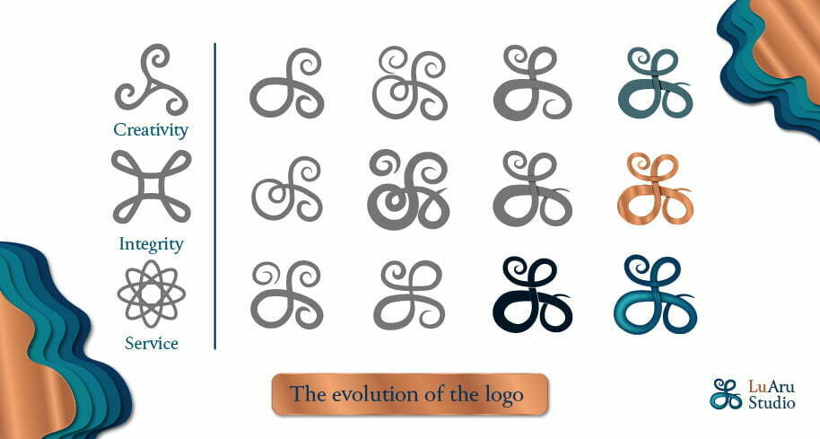
I love symbols. I was always mesmerised by the idea that a single object can have multiple meanings. That’s what guided me through my web design marketing and logo process too. Since I had my three words, three values if you may, I looked it up on the mighty google of what symbols they entail. And I basically came up with three pictures over and over again. But I didn’t want my logo to be just a symbol for creativity or integrity. I wanted it to mean them all. So that’s when I started drawing. I must admit, it didn’t come to me in an instant.
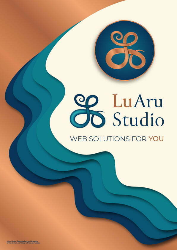
Actually, the idea of combining those symbols into letter L came when I was thinking about something completely unrelated and then noticed that the way I write L looks a lot like a symbol for creativity. And that’s when I just let my hand explore. The final logo only came to be in the Illustrator when I started seeing more opportunities by moving parts of logo around. I believe that the logo curves and ongoing loops perfectly match the symbolism of creativity and integrity. But also, if you look closely at the shape, you can almost see a leaning woman’s head into arms of embrace, a perfect symbolism for care and service.
Choosing typography
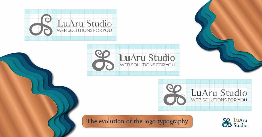
I knew one thing with my typography – I didn’t want LuAru Studio to be written in script font, because I felt that logo fulfilled that need of soft lines, I needed something to balance the curves out. But I also didn’t want it to go too far the other way, making the logo too cold and inaccessible. Canto Pen felt like a perfect choice, especially the “i”’s dot in the word Studio, somewhat matching the droplet shape inside of the loops. As for the accompanying font I chose Montserrat for its sophistication and beautifully rounded “o”s. I found that they will go nicely together in the Web context too.
Choosing colour palette
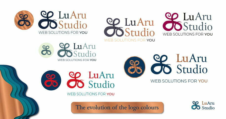
This was the hardest part. I guess as someone who sees a lot of shades, I was so overwhelmed with choices. I knew what colours I liked but they felt more like my personal brand rather than the business brand, so I had to think through it all. Once again, I am big on symbolism and feelings, so even if I knew the meaning of colours by heart I still went back and did deeper research to find what I am looking for. I knew that I wanted the blues in the logo because it means integrity and creativity all in one, but more than anything it creates a feeling of trust and security. That’s what I wanted to share. But there are just so many shades of blue. I liked Navy because for me it also means luxury. But teal was my colour for the past couple of years and I just couldn’t get away from it. And until I got there, I tried lots of shades of grey, blue, red, and yellow when I finally came to the monochromatic teal, matched with browns that can eventually be created into copper metal colour gradient. I even asked my online friends for help to determine which colours matched best. Then my family voted and came up with the same answer. In the end I made a mix of two final versions and felt rather proud of the process. More so the fact that I survived it, doing it myself.
Final thoughts about the website branding process
Branding is like clothes that we are wearing daily. It says a lot about us to the world (whether we like it or not, people make assumptions). Growing into our style takes time. Branding takes time too. It’s not enough to choose a logo and colours, everything else must be harmonic too. The voice the brand speaks, the things it represents, the change it creates in the world.
I like the process of creating something so symbolic and powerful. It’s always fun to research and come up with ideas that might outlive us.
Do you feel your brand? Does your brand have a story? Or maybe you have a story that you want your brand to tell? Go through website branding and marketing process with me and you will have a nice story to share too. Contact me and let’s chat about things that inspire you.
